Equicom Technologies · 16 Jul 2025 - 21 Aug 2025
Equicom Branding
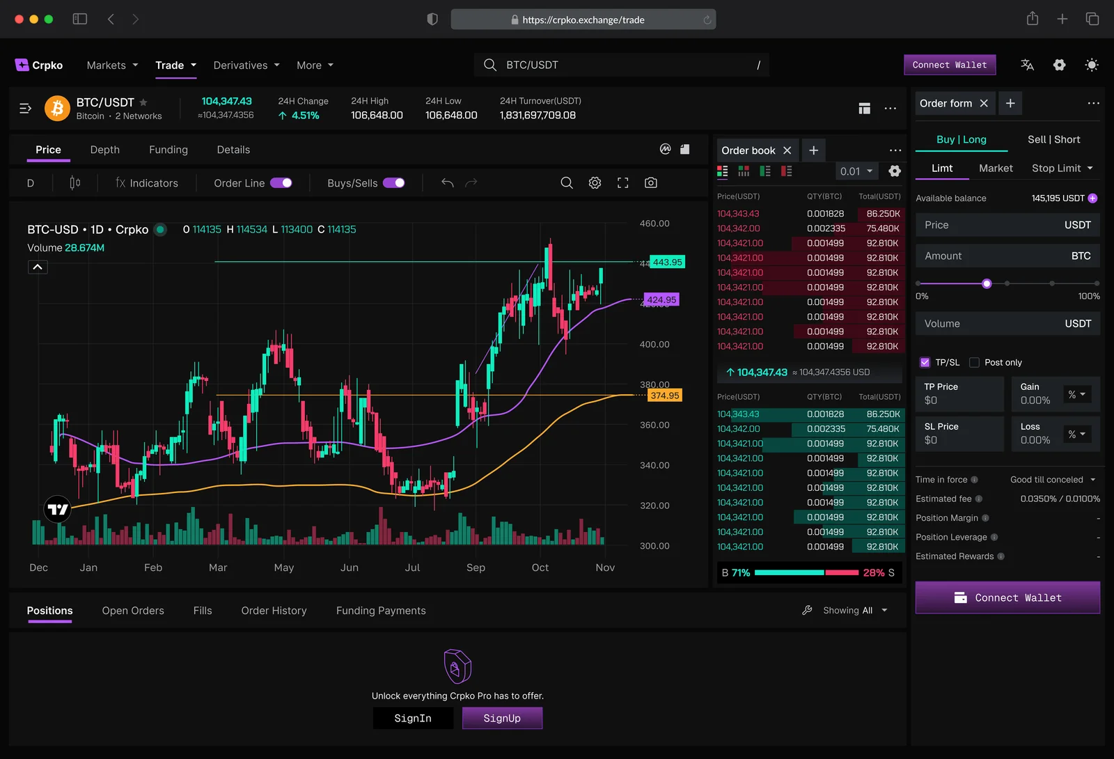
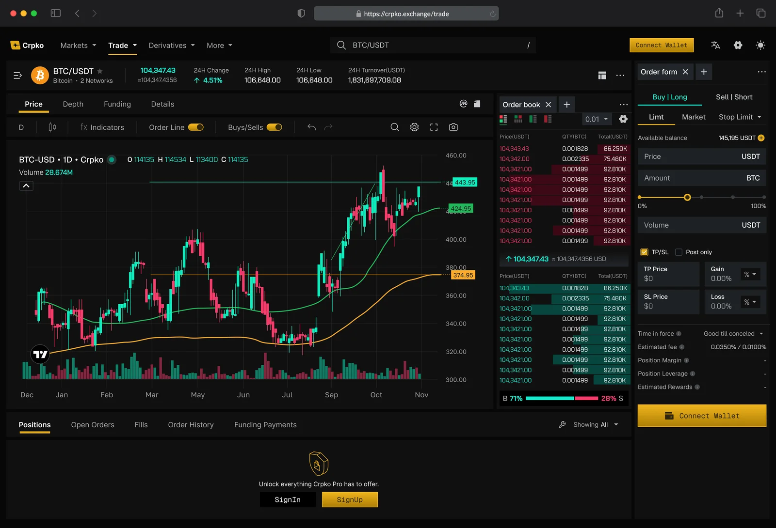
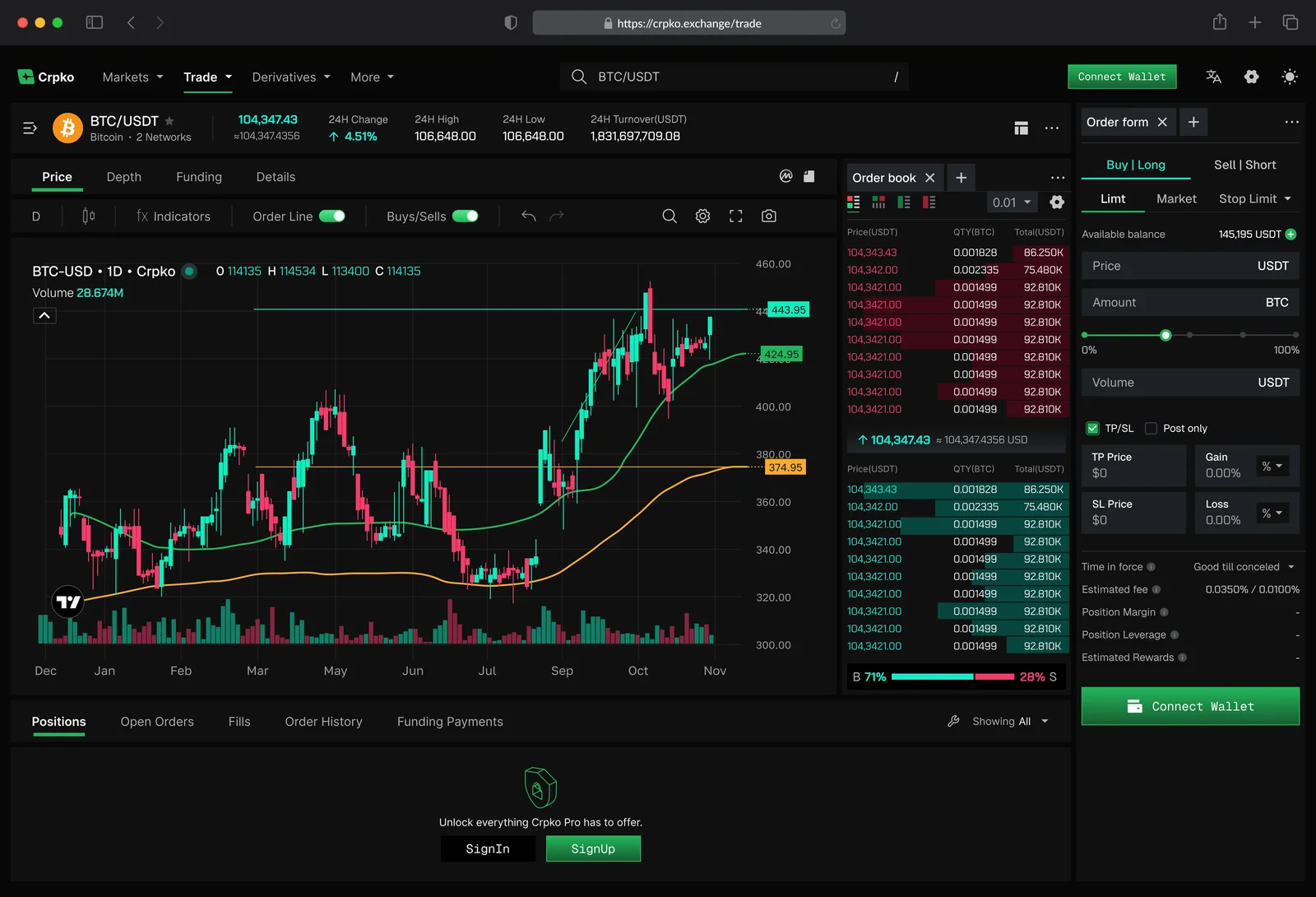
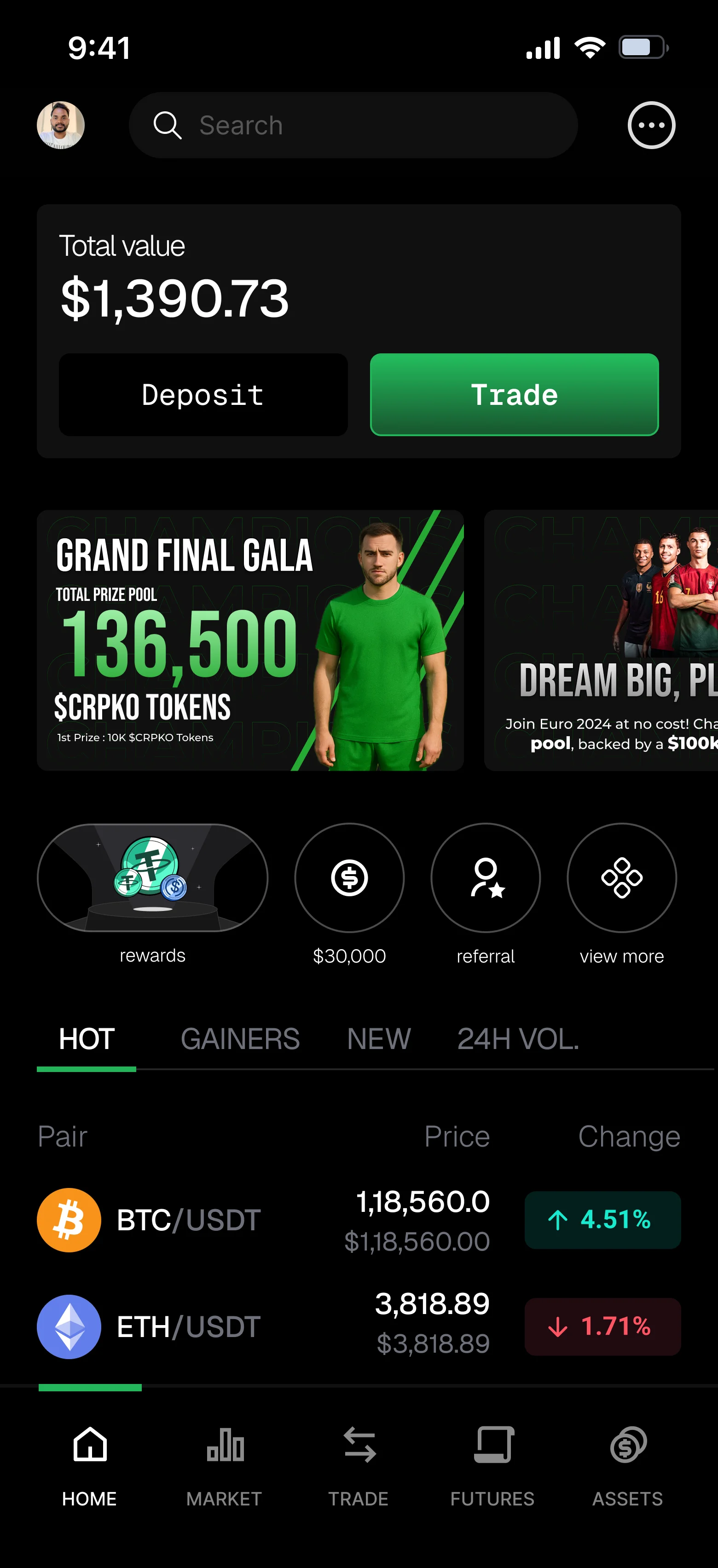
A visual exploration phase for the exchange identity. I tested colour systems, landing-page direction, mobile home surfaces, and trading-terminal themes before the product UI moved into a clearer brand language.

Period
16 Jul - 21 Aug
Scope
Brand colour test
Surface
Mobile + Web
01
Brand colour test
The first pass framed CRPKO as a mobile and web colour test, using the Equicom mark and exchange surfaces as the proving ground.
02
Exchange interface directions
The web app mockups tested how different colour families behave inside a dense trading terminal: charts, order book, order form, navigation, and wallet actions.
03
Mobile home explorations
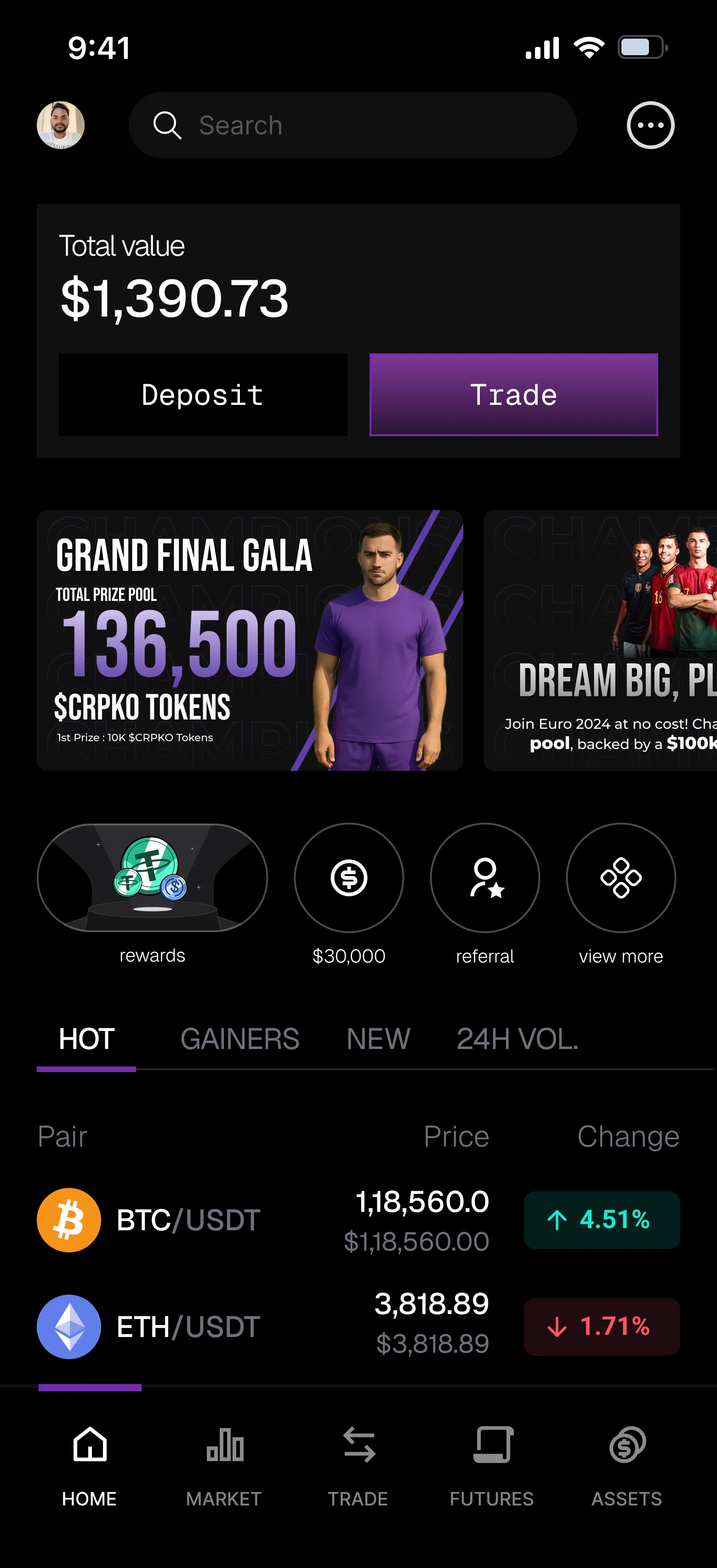
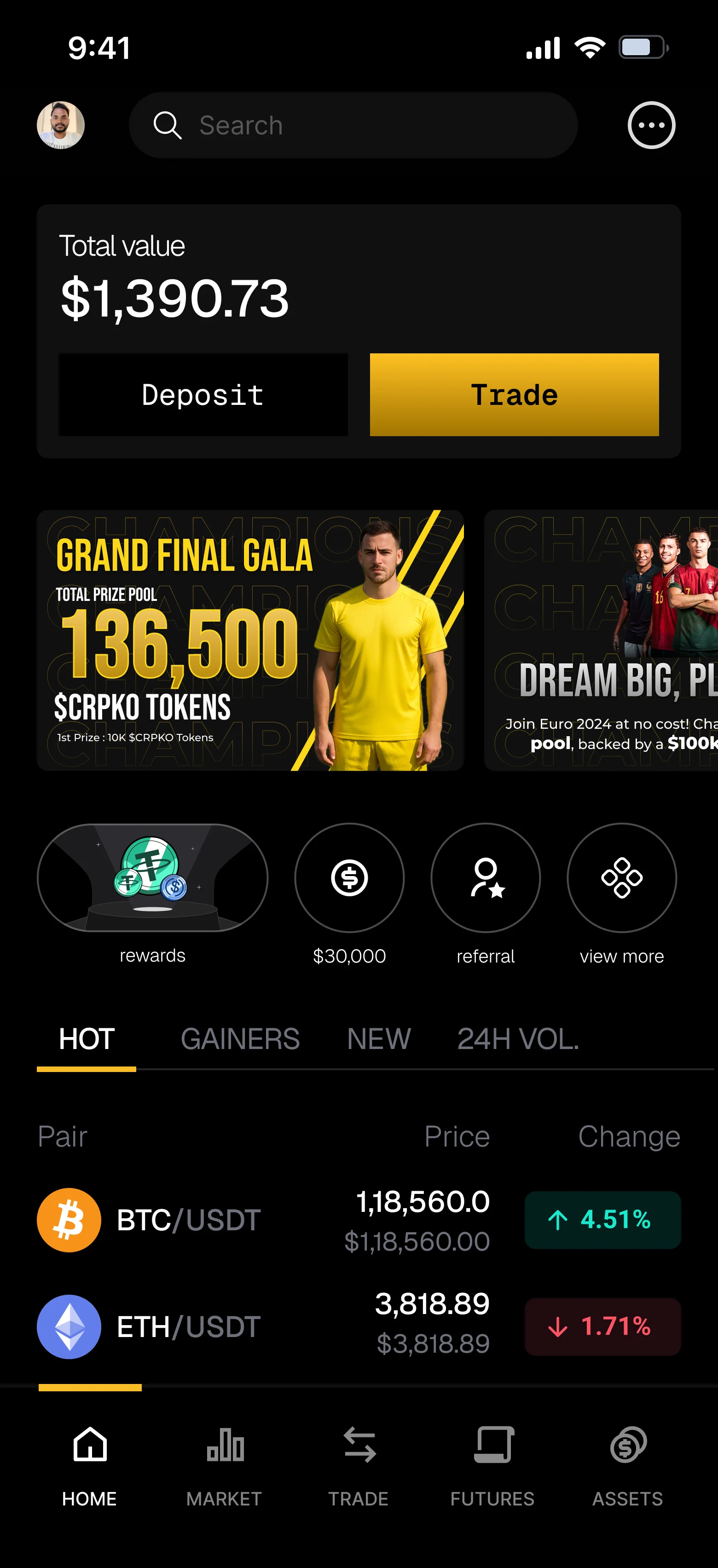
Mobile trials explored how the brand could feel in everyday exchange moments: portfolio value, trade entry, campaigns, quick actions, market lists, and bottom navigation.
04
Website static directions
The landing-page static screens tested the brand from a public-facing angle: launch CTA, exchange promise, hero composition, and product credibility.



Next