Quick overview
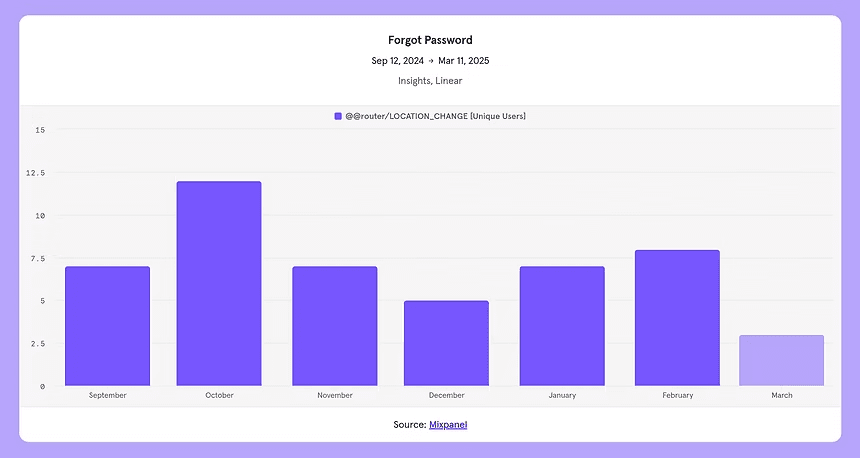
This was part of a larger effort to improve Entytle's application onboarding. The password moment mattered because it sits right at the edge of access, trust, and support: when a user forgets a password or struggles to create one, the product can feel blocked before the actual value appears.
Why it mattered
Entytle's Insyghts users are primarily sales managers. Onboarding needs to create a strong first impression and get them into the product without turning security into a guessing game. Unlike many B2C products, B2B platforms often still depend on internal email-password authentication, so the password flow has to work harder.
Signal
7
users went to forgot password in the last 6 months
Cost
11h
estimated yearly time lost to password-creation friction
Audit
20+
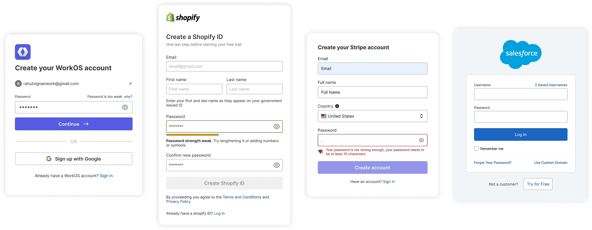
B2B and enterprise password forms reviewed
The problem
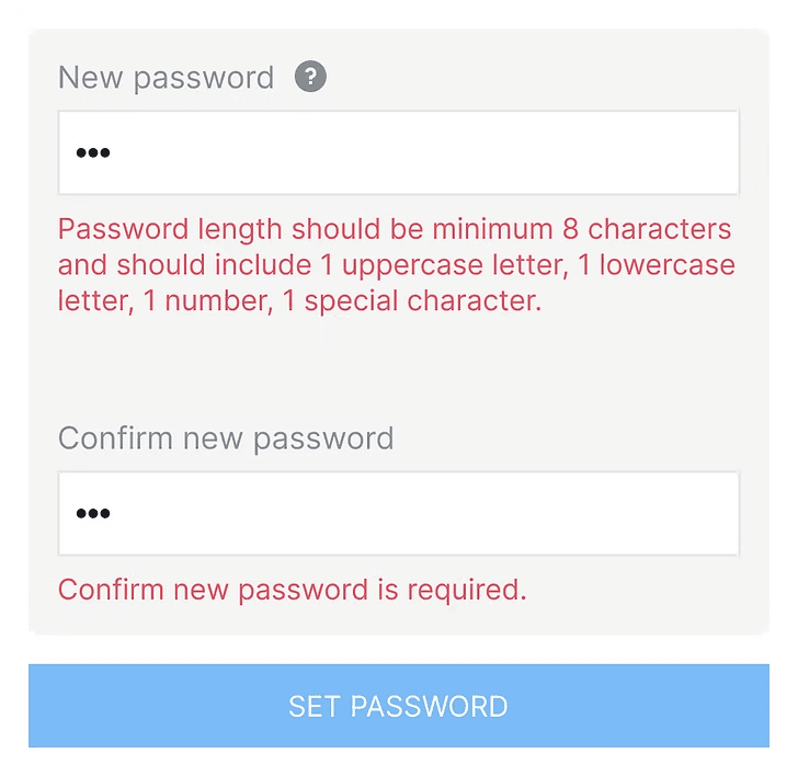
The existing form relied too much on on-exit validation. Users would finish typing, leave the field, and then discover the rules. That made instructions feel like mistakes. The study split the problem into three UX questions:
Requirements
Due to on-exit validation, the form throws errors after typing. The message reads like a mistake instead of an instruction.
Show/Hide
Users make mistakes, and no clear validation or intentional show-password control is a big risk for password entry.
Strength
The user has no simple answer to the key question: how strong is this password?
Research direction
I audited 20+ B2B and enterprise forms, comparing requirement patterns, error states, show-password controls, and strength indicators. The goal was not to reinvent password creation. It was to reduce friction while keeping security expectations clear.
Research notes
Asset placeholder. You can share this one later and I’ll wire it here.
Design decisions
The final direction prioritised clarity over cleverness: fewer rules, clearer copy, live validation, explicit show-password behavior, and a familiar strength meter.
Try 1: visible requirements
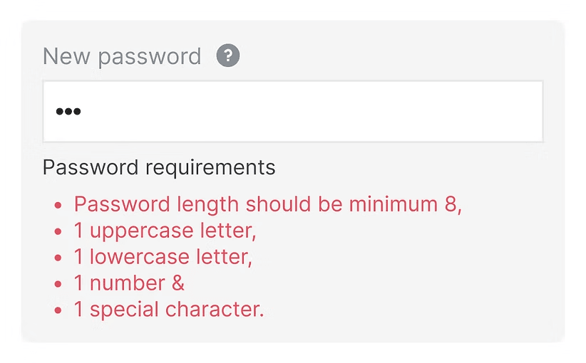
- Pro
- Full clarity up-front. Checking off each requirement can feel satisfying when the visual state improves as the user types.
- Cons
- Text-heavy and demanding on attention, especially before the user understands why every rule matters.
- Decision
- Keep the clarity, but reduce the weight through copy and visual treatment.
UX copy
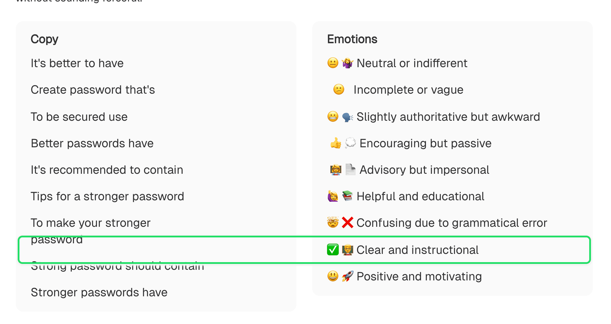
Clear without sounding forceful
I decided against language like “your password must contain” because it sounded too mandatory. The goal was to improve password security while keeping the tone professional, motivating, and easy to act on.
“Strong password should contain” was selected because it aligns with the need for clear, authoritative instructions in an enterprise setting where security is paramount.
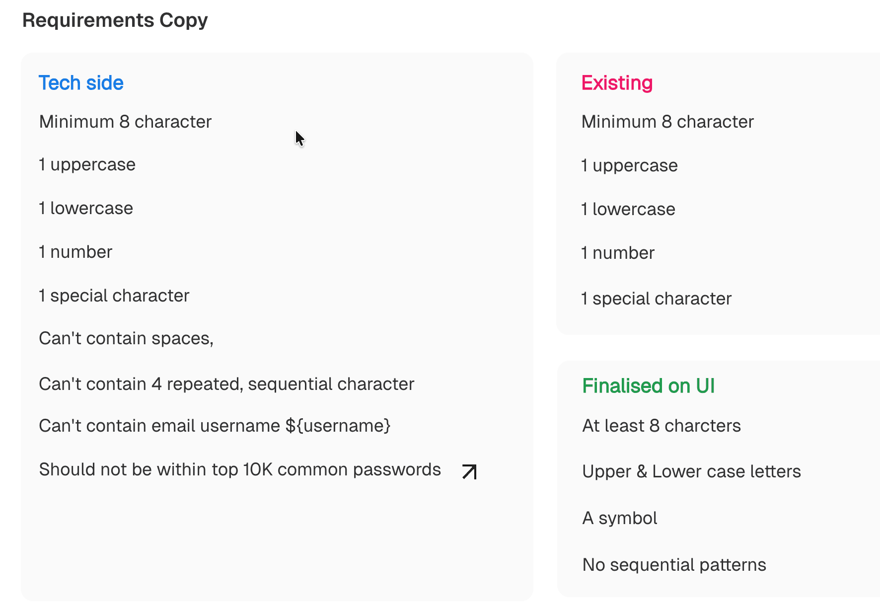
Tech side
- Minimum 8 character
- 1 uppercase
- 1 lowercase
- 1 number
- 1 special character
- Can't contain spaces
- Can't contain 4 repeated, sequential character
- Can't contain email username ${username}
- Should not be within top 10K common passwords
Existing
- Minimum 8 character
- 1 uppercase
- 1 lowercase
- 1 number
- 1 special character
Finalised on UI
- At least 8 characters
- Upper & Lower case letters
- A symbol
- No sequential patterns
Chapter 2 · How
Improving requirements visually
A seemingly simple component turned out to have many parameters that affected the experience: clarity, visual weight, check-off satisfaction, error pressure, and how much reading the form demanded.
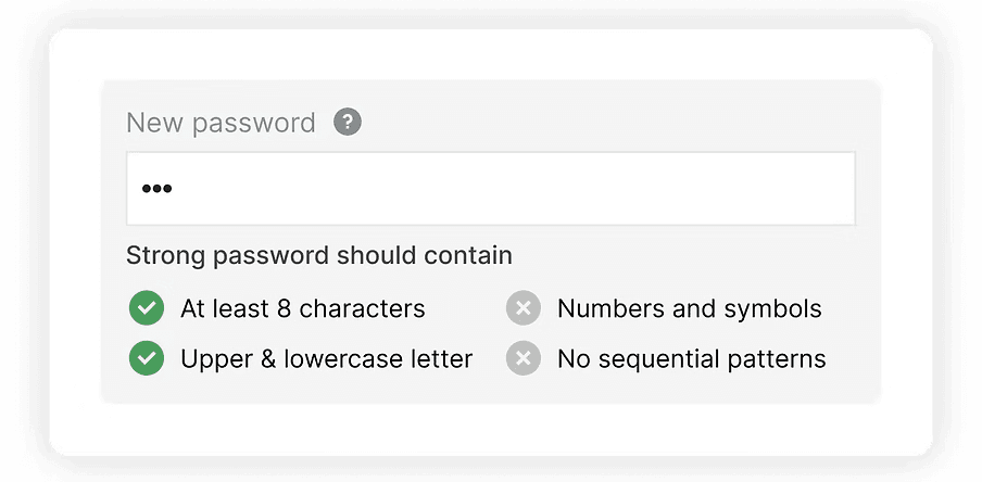
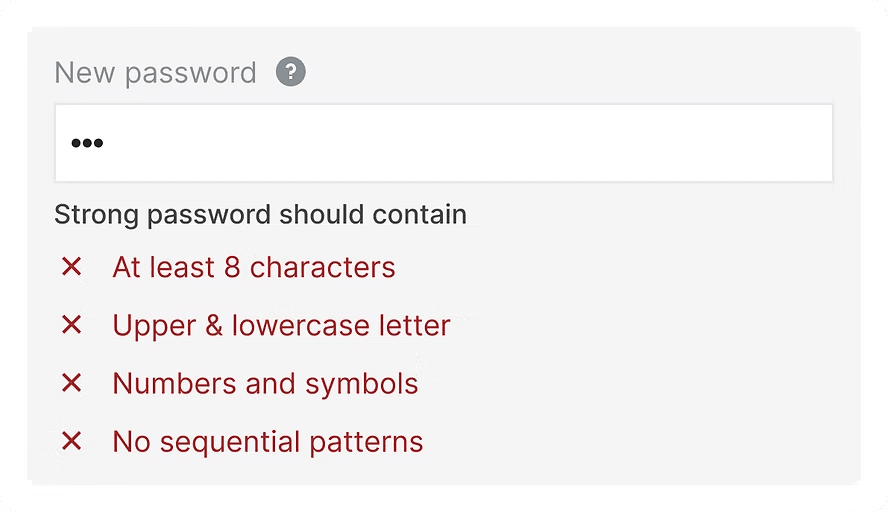
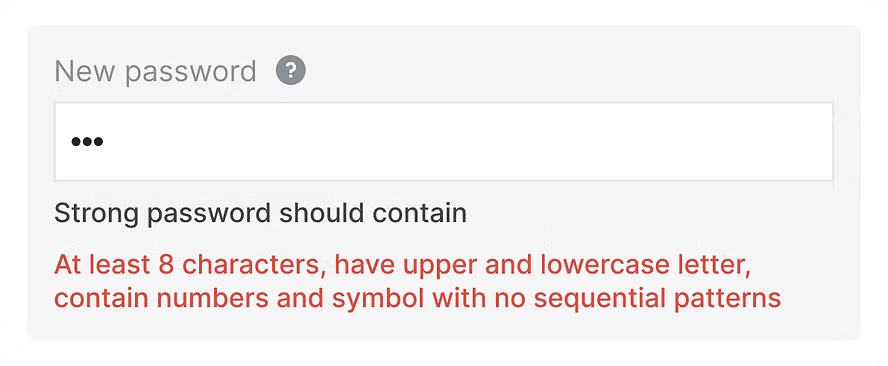
I prioritised clarity over simplicity here. Being explicit gives users a clear path to completion, while the visual treatment can reduce the heavy feeling of a checklist.
Make requirements visible
The current form waited until exit to show failures. That made guidance feel like punishment. The redesign moves rules into the flow so users can correct as they type.
Use motivating requirement copy
Instead of “your password must contain,” the chosen tone was closer to “Strong password should contain,” which stays clear without feeling hostile.
Prefer text for show password
Eye icons are implemented inconsistently across products. A checkbox or explicit text label makes the action easier to understand and more accessible.
Use a progress-style strength meter
The strength bar gives immediate feedback, a sense of progress, and a small moment of satisfaction in an otherwise dry security task.
Try the interaction
This coded version turns the original GIF idea into something visitors can touch. The important shift is live guidance: rules update while typing, so the form teaches instead of waiting to complain.
Interactive demo
Create a password
Strong password should contain
This copy keeps the tone instructional without sounding like an error before the user has typed.
- At least 8 characters
- Upper & lower case letters
- A symbol
- No sequential patterns
Assets to add next
These are placeholders for the visuals you'll share one by one. Once the GIF arrives, I can use it as the reference for a richer HTML recreation, and later we can add an explode-style breakdown like the CRPKO header page.
Show password options
Asset placeholder. You can share this one later and I’ll wire it here.
Weak / medium / strong states
Asset placeholder. You can share this one later and I’ll wire it here.
Final GIF reference
Asset placeholder. You can share this one later and I’ll wire it here.
Learning
The case study's main lesson is that accessible form design is detail work. A small password field carries copy, validation, state, security perception, memory support, and user confidence. When those details work together, the product feels easier before users even reach the dashboard.